How often have you bought food because of its packaging? Even if you weren’t doing so consciously, food packaging design plays a huge role in what we buy to eat.
As a seller, how do you know whether your design is appetizing to your audience? Should you go for eye-catching bright shades or toned-down neutrals? What font style should you use?
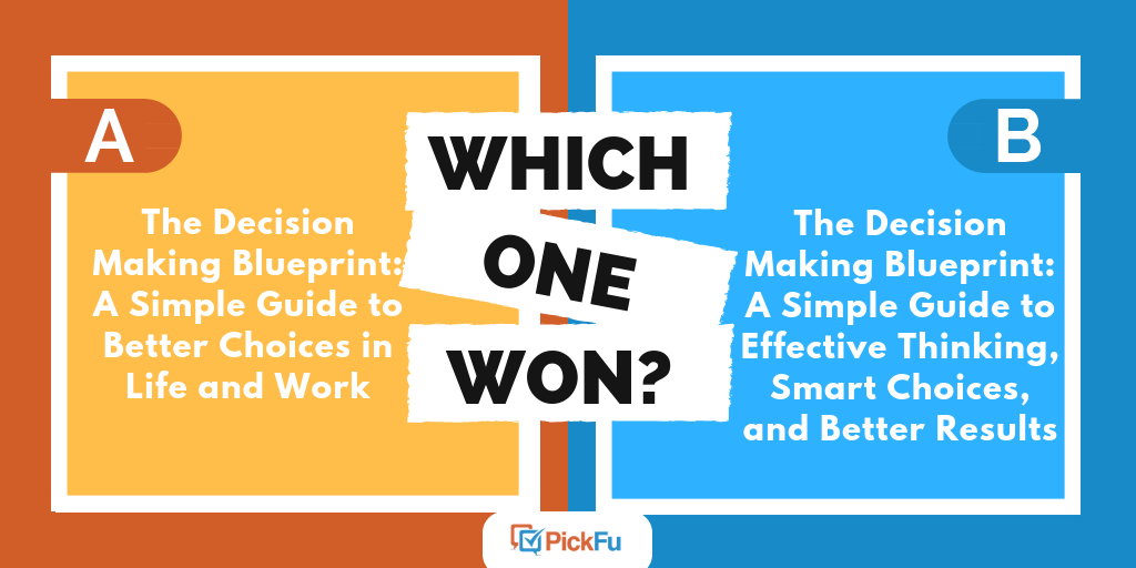
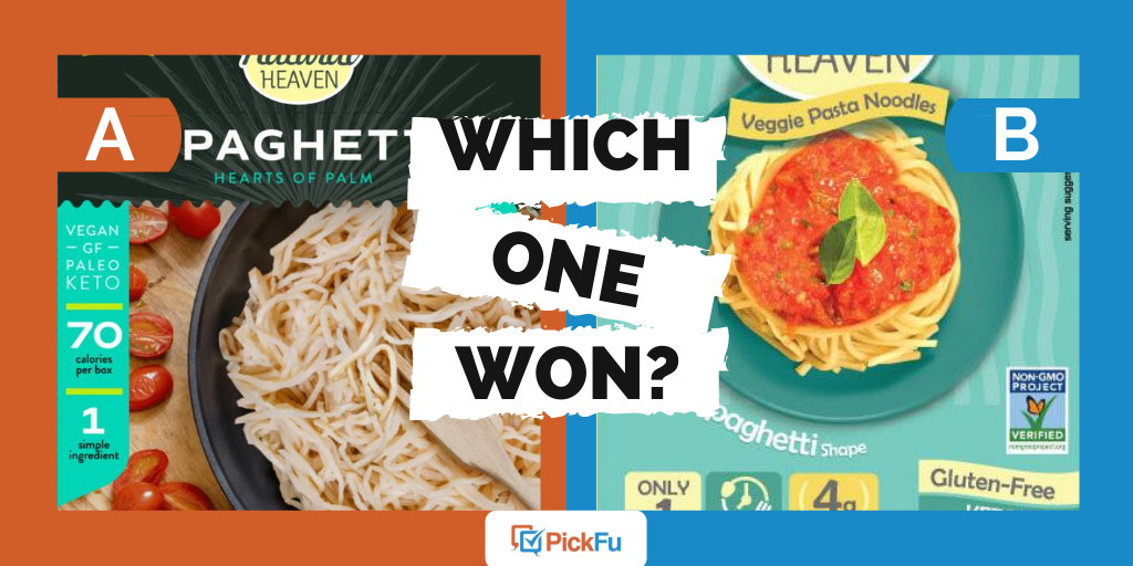
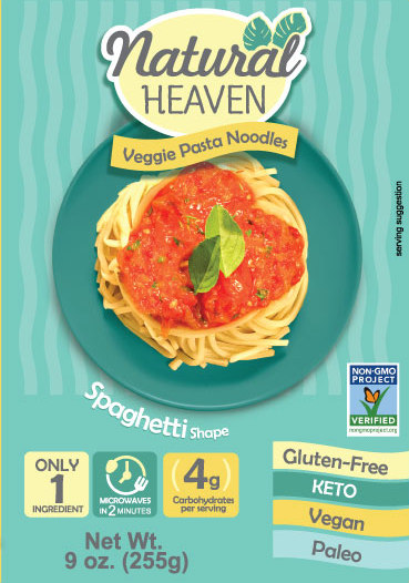
In this PickFu poll, Natural Heaven, makers of a veggie pasta noodle, asked 50 Amazon Prime members which image they found more appealing. Can you guess which one won?

Which food packaging design won?
Option A won this poll with 32 out of 50 votes.
Here’s some of the feedback that the business owner received:
- “I chose [Option] A because I think the words about calories and being vegan are more clearly illustrated. The green panel on the left stands out more. I also prefer that the cherry tomatoes are on the table instead of mixed in with the pasta. I think this highlights the pasta more; it doesn’t cover up the spaghetti image as it does in choice B.”
- “I really like the colors of [Option] B, but I think the product looks super fake and overly processed from the picture. I get a very healthy vibe from [Option] A and that what I’m eating is fresh and not super manufactured”
- “I would be interested in trying both of these products. To me, the packaging of [Option] B is more appealing in that it looks like a dish I would normally make myself. The noodles in [Option] A look a bit strange and plain, which is fine, but to me does not look as appetizing. Having said that, I like how [Option] A tells you what the ingredient is, hearts of palm in this case, whereas [Option] B says it is made of 1 veggie ingredient but does not specify which veggie that is. It would be helpful if it mentioned the vegetable on the front.”
- “Option A shows the product to be much more appetizing than in option B. I also like that there were a few natural ingredients on the side you could pair with the main product, but it wasn’t completely covered in a sauce that wasn’t coming in the package.”
How to make your food packaging design appealing
It’s difficult to know for certain whether your infographics, color choices, and imagery will resonate with customers. That’s why a PickFu poll is so useful to get outside feedback on designs.
In this case, the seller discovered that many customers found Option B to be confusing and even fake-looking. On the other hand, Option A more clearly showcased the product and its features.
If you’re considering food packaging designs for your own brand, why not try your own PickFu poll? Within minutes, you’ll know whether customers will want to eat your product right up.