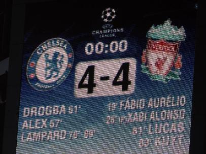
As Americans, we often scratch our heads at the legions of international soccer fans who can live with a tie. A score like 2-2 (or even worse, a 0-0 draw) is so inconclusive — we like the clarity of winners and losers. When a game ends tied, how are we supposed to feel?!
But a tied game is still hard-fought. The players still put it all out on the field, exert huge amounts of effort, and in the end, are shown to be evenly matched. Alan Jacobs wrote an impassioned defense of ties a few years ago in the Wall Street Journal. In it, he writes,
“Since scoring is so rare, many matches end 0-0 or 1-1. And this is something that we soccer fans don’t just accept about the game: we love it. We love that scoring is so darn hard, that, most of the time, many interlocking pieces of game action have to fall into place just so in order for the ball to make its way into the back of the net. We want it that way.”
This is a good lesson when your PickFu poll ends in a tie. It’s difficult to score big with an audience. You probably know (or are) someone who will only drink Coke or only drink Pepsi. These are passionate, insistent customers. But you also probably know someone who doesn’t have a cola preference, or even can’t tell the difference. (Obviously, Coke is superior).
When your PickFu poll ends in a tie, it could mean that the audience saw little discernible difference between the options presented. Or it could mean that equal-sized segments of the audience showed a strong preference for their choice. In either case, a tie is information that in itself can be valuable.
What to take away from a tie
First of all, a tie could mean your options are equally preferable. Hooray for you! You offered good options. You could interpret this to mean that whatever avenue you go down, a segment of your audience will be amenable to it.
One PickFu pollster wanted to know which pricing model customers would prefer for a travel adventure package. The first choice was to pay between $25-35 for the itinerary and pay separately for the activities, and the second choice was an all-inclusive model. In a poll of 50 respondents, 26 preferred the first, and 24 preferred the second. While not a numerical tie, it’s a statistical tie without a clear winner.
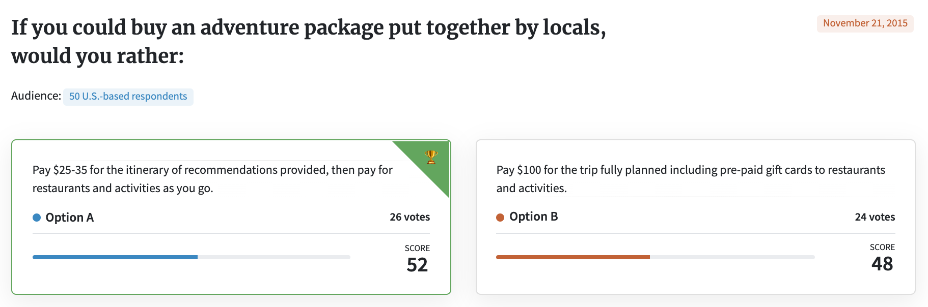
A reasonable conclusion might be to offer both options to customers. That way each client can pay according to his or her preferred pricing model. This is similar to what we do here at PickFu — offering both à la carte and subscription options because everyone’s needs are a little different.
Dig deeper
Another way to get insights is to dig deeper into the comments. Are respondents confused about something? Is there an element that consistently causes them to react negatively? See what you can glean from what people said, and use this knowledge to choose the winner or to iterate on a new version — a version that, perhaps, might become a clearer winner.
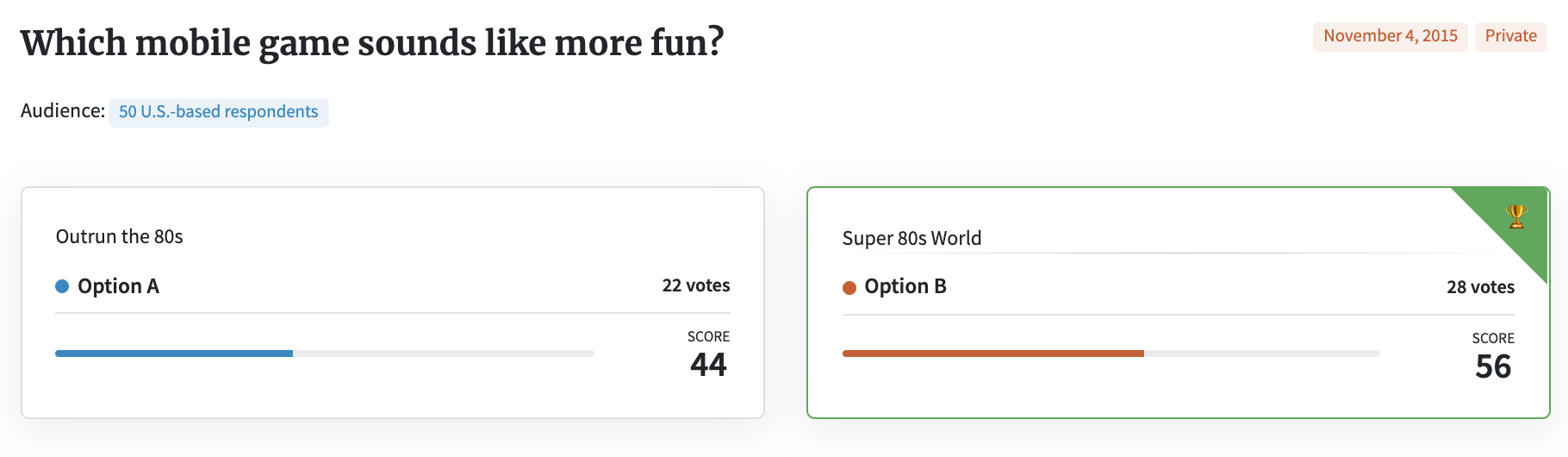
When Michael Cowden, another PickFu pollster, wanted to name his mobile game, he tested two potential names: Outrun the 80s and Super 80s World. Super 80s World won, but only narrowly — by a margin of six votes. Should those six votes be decisive?, he asked himself. In the end, the decision was yes.
Based on the comments, those who voted for Super 80s World were closer to his game’s intended target. As he wrote on his blog, “I could immediately tell that Super 80s World communicated the game concept much better. The folks that liked that name got what the game was about and, more importantly, wanted to play it!”
When should you retest?
While Super 80s World ended in a close result, another game with two potential names ended in a perfect tie. A poll of 50 mobile gamers split right down the middle when choosing between Squid Attack! and Squid Squad.
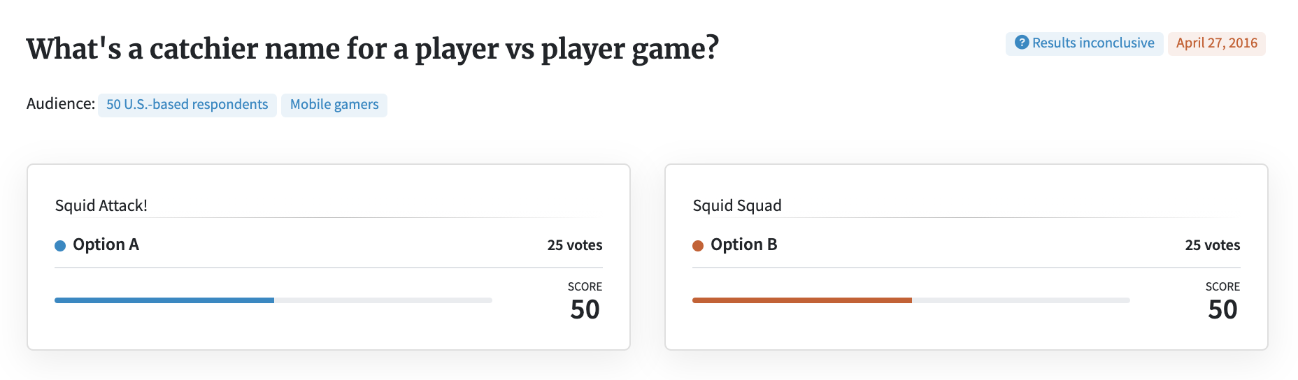
Many respondents liked the alliteration of “Squid Squad” and thought it was fun to say. But respondents repeatedly commented that a “squad” suggests cooperative play (which the game is not), while “attack” sounds more like a player vs. player game (which it is).
So what should this pollster do?
Personally, I would choose the option that reflected the player vs. player game format. But if the decision-maker was still unsure, another idea is to add more respondents. With a larger pool, you’ll receive more comments, and these additional voices may help clarify the road ahead. If a poll is not statistically significant, adding more respondents may also help achieve that significance — which means that the results are likely to be replicated were the poll to be run again. More respondents can also reinforce what the first pool of respondents said, and affirm that many people agree with them.
When to re-examine your options
A tie may also mean that the options you tested were not distinct enough. For instance, one PickFu pollster tested two logos that were identical except for the color. With 100 respondents, 50 chose orange and 50 chose blue. Many comments gave reasons such as “Prefer orange to blue,” or “Blue just looks better in general.”
Back to the Coke/Pepsi analogy, some people just like Pepsi. Others are right and love Coke (just kidding — sorta). However, most people simply don’t feel strongly one way or the other, such as these comments in the orange vs. blue debate:
• “Not very interesting a question, given that they’re the same logo just palette-swapped, but I like the blue more. But it really doesn’t matter. They’re pretty similar.”
• “Not really that different, I slightly prefer B because it’s blue and I like that color better. Everything else looks the same though.”
• “I prefer the color scheme of choice A, however it is not overwhelmingly better”
It may sound harsh to say it’s just a toss-up. Should you really just flip a coin with an important decision like this?
Not necessarily. Respondents in this poll also gave comments about what they read into each color, and you might take some of their ideas into consideration.
“The orange is more aggressive,” wrote one male. A female respondent agreed, writing “I find the orange logo (option A) much more preferable because it feels more action-oriented and looks cooler than a blue logo, which makes me feel calm.”
Another person surveyed wrote, “The blue seems cooler, more masculine,” while yet another wrote, “The orange makes it stand out a little more. It also seems like it would be a little more gender neutral.” “Blue is a cooling, calming color,” one male said. “It hints at ‘newer tech’, and makes the user feel like theyve made a sound decision.”
The feedback may be contradictory, but taken together, it may also add confidence to the direction you were already heading, or open up new questions you hadn’t considered. The ultimate tie-breaker in a decision like this is you. You can use your own discretion about which points reinforce your position, and those that make you think a bit differently.
How do you feel about ties? Have you been torn between two options before? Let us know in the comments!